Form Designer
Overview
The Form Designer is the tool in which forms are built. It provides you with various form controls, a design area to layout your form, and access to various form and control properties. It also provides a place for setting up Rules and Actions. Rules are sniplets of JavaScript that can manipulate the form at run-time. Actions define what happens with form data when the form is submitted by a user.
This page will cover the basic layout and design of forms.
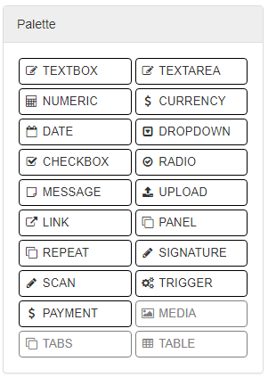
Palette
The palette is displayed to the left and is the toolbox from which you can build from. It contains a drag-and-drop collection of controls that can be added to your forms by dragging them into the design space on the right.
Design Space
The design space where your form is built and layed out is on the right. It provides a WYSIWYG (What You See Is What You Get) rendering of the form as it would appear to users, and allows you to rearrange and manipulate the form as needed. Clicking on a control will also cause the properties of that control to be displayed in the lower left.
Note
Whenever you make changes on a form in the designer, those changes are saved immediately. A message next to the title of the form will provide the status of this by displaying either “Saving…” or “Saving complete.”
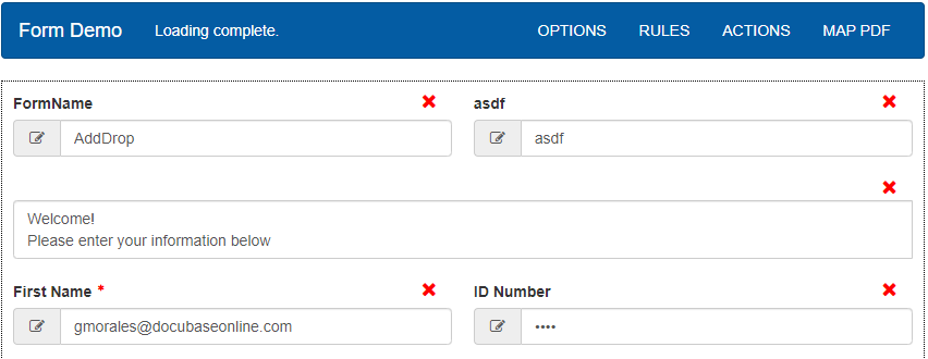
To add controls to your form, drag the control from the palette to a location on the form. A green arrow will show which direction the control will be dropped.
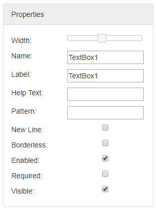
Properties
- The properties of the highlighted control appear in the lower left of the screen. The available properties vary from one type of control to
- another, but they generally allow you to set the name and label of each control on the form, perform resizing, help text, pattern matching,
and to toggle various other options. For specifics on controls and their properites, see Controls.
The following are the most commonly used properties in the form designer:
Width: Resizes the control relative to where it is. For example, setting the slider to half way makes the control half the width of the form.
Name: Unique identifier for a control.
Label: The visible name for a control. Can be formatted with markup.
Help Text: Adds a question mark bubble which shows text when moused over.
New Line: Places controls on the line below any preceding controls.
Borderless: Removes the outline from controls.
Enabled: When this is checked, users can edit the data inside this control.
Visible: If unchecked, users filling the form will not be able to see this control.
Options
The options menu can be found at the top of the form, and provides the ability to enable or disable certain features on the form
Geolocation
Geolocation allows the form to gather data using a user’s location. Location may be based on a devices’ GPS. If the device does not have a GPS, the form gets an estimated location based on the network a device is connected to. Once geolocation is enabled, the information is accessible using form Rules.
Note
Users need to agree to allow the form to collect location data.
Connective eSign
Connective eSign allows for forms to be signed with a secure, encrypted digital signature. When submitting a form users will need be redirected to the connective platform for the signature process. Users will also recieve a link to their email if they wish to sign later. Once they finish signing they will be emailed a download link of the signed form.
To configure eSign on a form, fill in the fields on the form options. Fields can be filled using form data by putting a field name in curly braces.
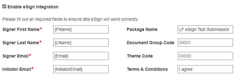
The signer related fields refer to the user filling the form. The Initiator Email be registered to an account on the Connective eSign platform. The Package Name is the label sent to eSign, and will be the name of the final file. The Document Group Code can be used to organize the forms in Connective, and the Theme Code can be used to apply custom designed themes in Connective. Any phrase in the Terms & Conditions field will need to be typed by the signer during the signature process.
Custom Confirmation Messages
The confirmation message is shown when a user successfully submits a form. Using this option, the title and content of the message can be customized. You may include form data by using a putting the field name inside of curly braces
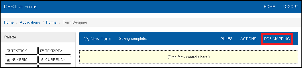
PDF Mapping
Once all the controls on a form are created, it is possible to map the data of those controls onto PDF with text fields. The PDF with the mapped fields is filled in using values form the form and will be used instead of the default generated PDF at submission. To manage the PDF mapping, click “MAP PDF” the top right of the form designer.
If there is no PDF mapped to the form, the initial pop up panel will ask for the PDF the form should map to. This can be selected from the systems file browser. Currently LiveForms does not support PDFs with embedded scripts. Once a PDF is selected, click “Upload Template” to confirm the selection. The next step is to map the PDF fields to the existing form fields. Each PDF field will have a dropdown used to select a control ID. Once all controls are mapped, click save at the bottom right to complete the mapping. All mapped fields in the form will appear with a blue flag after getting mapped.
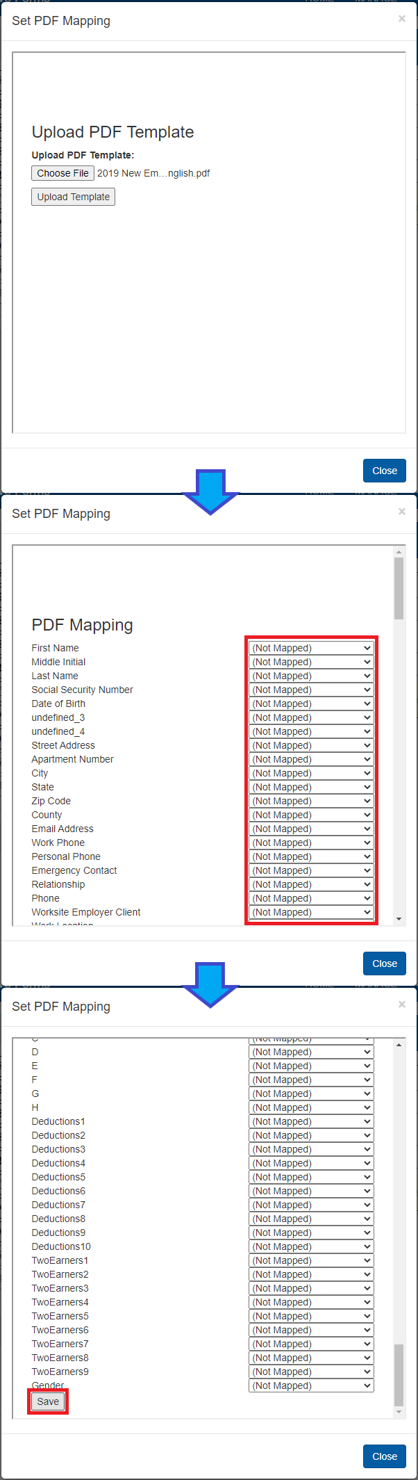
If a PDF has already been mapped to the form, clicking on “MAP PDF” will let you edit the PDF mapping.
Versioning
Once you have finished designing a form, you may save a version of the form by clicking Save Version at the top right of the designer interface. A confirmation popup will ask if you would also like to publish the current verision.
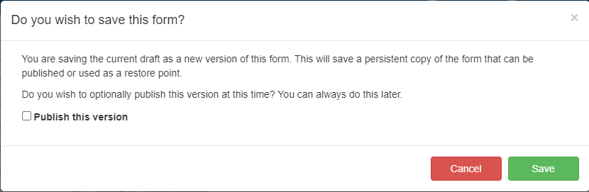
Saved versions may be published later through the forms list.
Note
A form will not be accessible until it has been published and given the correct permissions.
Viewing a Saved Version
You may see a preview of the current form or a form version by clicking on View in the top toolbar. This brings a popup where you can select which version to view.
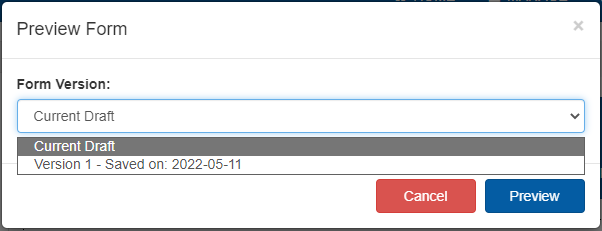
The resulting preview will look and function the same as when someone is filling out the form.